
The Brand Perception Atlas – A Technical Deep Dive
The Brand Perception Atlas, is an interactive decision-support tool that helps brand teams understand, compare, and explain brand perception across platforms. It combines embedding-space visualization (UMAP) with interpretable clusters, and cross-platform consistency scoring. The result is a tool that moves teams from “interesting maps” to recommendations that are better documented and easier to explain, because they link back to specific underlying perception signals and clearly show where sources agree or disagree. These can be used in brand reviews, competitor analysis, and campaign planning. Read the Executive Summary for more information and results.
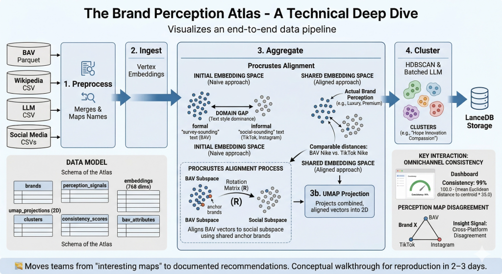
Goal: a newcomer can reproduce the core outcomes in 2–3 days. For full setup and running instructions, refer to the GitHub README — this walkthrough provides the conceptual map and domain knowledge needed to understand what the code does and why.
🧭 A note on what made this hard. The Brand Perception Atlas looks deceptively simple — embed text, project it, cluster it, display it. In reality, the single hardest problem was getting five fundamentally different perception sources to coexist in a shared space where distances actually mean something. WPP Brand Asset Valuator® (BAV) data comes from structured survey scores transformed through an LLM (Gemini) into prose. Social data comes from raw video transcripts and post captions, also transformed through an LLM (Gemini). Even though both pass through the same embedding model, the linguistic fingerprint of each source dominates the resulting vectors — the map would split cleanly into “survey-sounding text” vs “social-sounding text” rather than grouping brands by actual perception. Solving this required iterating through prompt normalization, aggregation rebalancing, and ultimately Procrustes alignment — a technique borrowed from shape analysis that rotates one embedding subspace onto another using shared anchor brands. Section 6 tells this story in full.
1. Architecture Overview
    flowchart LR
    A["BAV Parquet"] --> E["1. Preprocess
Merges & Maps Names"]
    B["Wikipedia CSV"] --> E
    C["LLM CSV"] --> E
    D["Social Media CSVs"] --> E
    E --> F["2. Ingest
Vertex Embeddings"]
    F --> G["3. Aggregate
Procrustes Alignment"]
    G --> H["3b. UMAP Projection"]
    H --> I["4. Cluster
HDBSCAN & Batched LLM"]
    I --> J["LanceDB Storage"]
flowchart LR
    A["BAV Parquet"] --> E["1. Preprocess<br>Merges & Maps Names"]
    B["Wikipedia CSV"] --> E
    C["LLM CSV"] --> E
    D["Social Media CSVs"] --> E
    E --> F["2. Ingest<br>Vertex Embeddings"]
    F --> G["3. Aggregate<br>Procrustes Alignment"]
    G --> H["3b. UMAP Projection"]
    H --> I["4. Cluster<br>HDBSCAN & Batched LLM"]
    I --> J["LanceDB Storage"]
Key constraint: All five perception sources must be projected into a shared embedding space so that distances are comparable across sensors. The pipeline uses Procrustes alignment to rotate BAV vectors into the social subspace via overlapping anchor brands, then UMAP projects everything into 2D. The system maps the ideas behind the words, not just the text — “Luxury,” “Premium,” and “Prestigious” land in the same neighbourhood.
<aside> 💡
Why this architecture isn’t obvious. A naive approach would be: embed everything → UMAP → cluster → done. The catch is that embedding models encode how something is said as much as what is said. A BAV narrative generated from “Helpful (45.2), Reliable (38.1)…” reads nothing like a TikTok perception report, even when both describe the same brand. Without the Procrustes step between “Ingest” and “UMAP,” the map would split by text style rather than brand perception. The arrows in this diagram look linear, but getting Step 3 (Aggregate) right took more iteration than every other step combined.
</aside>
2. Setup & Running
Full install and deploy instructions are maintained in the README. Below is a summary for orientation.
Internal (BitBucket — full pipeline with Vertex AI):
git clone <bitbucket-repo-url>
cd brand-perception-agent
uv sync

cd brand_perception/dashboard/atlas_pipeline
uv run python main.py --step all

uv run pytest
# ~6 functional / integration tests, <1 minute
Public (GitHub — two modes):
| Mode | Description | API keys required? |
|---|---|---|
| Default | Run locally with provided toy dataset (20 brands, 681 reports) or own dataset in same CSV format | No |
| Advanced | Plug in own API keys for LLM clustering and embedding models | Yes (GOOGLE_API_KEY, GOOGLE_CLOUD_PROJECT) |
Key dependencies: Python 3.12, lancedb, pandas, numpy, google-cloud-aiplatform, google-genai, tqdm, umap-learn, hdbscan, scikit-learn, streamlit
<aside> ⚠️
Gotchas for newcomers:
- **Vertex AI quotas.** The embed step hits
gemini-embedding-001in batches of 50. On a fresh Google Cloud Project (GCP) you may get rate-limited at ~60 requests/min. The pipeline handles retries, but if you see429errors, check your Vertex AI quota dashboard and request an increase before re-running. - **UMAP is not deterministic.** Runs with the same data can produce slightly different 2D layouts unless you pin
random_state. The pipeline does pin it, but if you fork and forget, your clusters will shift between runs. However, relative distances between points do not change, so interpretation will remain the same. - **LanceDB lock files.** If a previous run crashed mid-write, LanceDB may leave a
.lockfile that blocks the next run. Delete*.lockfiles in the LanceDB directory if the pipeline hangs on startup. uv syncvspip install. The project usesuvfor dependency management. If you install viapipinstead,hdbscanandumap-learncan pull conflictingnumpyversions. Stick withuv sync. </aside>
3. Data Model
| Table / Entity | Description |
|---|---|
brands | Master list of 200+ brands (internal) or 20 brands (toy dataset) with metadata (industry, country) |
perception_signals | One row per (brand × sensor) — raw text summaries from each source |
embeddings | Semantic vector per perception signal — gemini-embedding-001, 768 dimensions |
umap_projections | 2D coordinates per embedding after UMAP reduction |
clusters | Cluster ID, 3-word label (e.g. “Hope Innovation Compassion”), and member brands |
bav_attributes | 48 BAV imagery attribute scores per brand × 12 audience segments |
consistency_scores | Omnichannel consistency % per brand (mean distance to centroid across sensors) |
The data model below describes what lives in LanceDB after the pipeline runs. Think of it as the “schema” of the Atlas — each table feeds a different part of the dashboard UI. The key thing to understand: a single brand has multiple rows across these tables (one per sensor, one per audience segment, etc.). The perception map plots one dot per row in umap_projections, not one dot per brand.
Toy dataset format (CSV, used by public GitHub default mode):
| Column | Description |
|---|---|
Brand | Brand name (e.g. Aetherium, Zenith Dynamics) |
Industry | Industry category (Technology, Automotive, Food & Beverage, Retail, Healthcare, Finance, Entertainment) |
Platform | Source sensor: TikTok (Brand Known), TikTok (Brand Unknown), Instagram (Brand Known), Instagram (Brand Unknown), Wikipedia, LLM, Survey |
Survey_Audience | Demographic segment for Survey rows (e.g. Tech Early Adopters, Gen Z – Gamers); N/A for non-survey |
Brand_Perception_Report | Free-text perception summary |
4. Pipeline / Workflow
The table below is the quick-reference version. Commentary after it explains what’s actually happening at each stage and where things can go wrong.
| Phase | Key numbers |
|---|---|
| 1. Preprocess | Instant runtime, merges into 1 unified DataFrame |
| 2. Ingest (Embed) | gemini-embedding-001, 768 dims, batches of 50 via Vertex APIs |
| 3. Aggregate | Procrustes rotation on anchor brands; UMAP n_neighbors=min(15, len-1), min_dist=0.1, <5 sec |
| 4. Cluster | HDBSCAN (min_cluster_size=3/5). Several minutes via Gemini Batch labelling queue |
| 5. Consistency | max(0.0, min(100.0, 100.0 - (mean_dist_to_centroid * 35.0))) |
| 6. BAV join | Procrustes alignment via rotation matrix on overlapping anchor brands |
| 7. Atlas UI | Streamlit (instant runtime) |
Phase-by-phase commentary
Phase 1 — Preprocess. Deceptively simple: merge CSVs, normalize brand names, filter junk. The hidden complexity is name matching. BAV uses official corporate names (“The Procter & Gamble Company”), social media uses colloquial names (“P&G”), and Wikipedia uses yet another variant. preprocess.py maintains a manual alias map for this. If you add a new brand and it doesn’t appear on the map, check the alias map first — it’s almost always a name mismatch.
Phase 2 — Ingest (Embed). Each Brand_Perception_Report text gets turned into a 768-dimensional vector via gemini-embedding-001. The critical thing to understand: these vectors encode writing style as much as meaning. A BAV report that says “Helpful (45.2), Reliable (38.1)” and a TikTok report that says “this brand gives cozy reliable vibes” will land in different regions of embedding space even though they describe similar perceptions. This is the root cause of the domain shift problem solved in Phase 3.
Phase 3 — Aggregate (the hard one). This is where most of the iteration happened. Three things occur in sequence:
- Social aggregation: Multiple post-level embeddings per (Brand × Platform) are mean-averaged into a single vector, and Gemini generates a summary report. This smoothing pulls social vectors toward a shared centroid.
- Procrustes alignment: The BAV vectors are rotated into the social embedding subspace using 202 shared anchor brands (see Section 6 for the full story).
- **UMAP projection:** The combined, aligned vectors are reduced to 2D. Only the
'All Adults'BAV slice is fitted alongside social platforms — this prevents the 12 BAV demographic segments from dominating the topology.
<aside> 🔬
Why “balanced subset fit” matters. BAV has 12 audience segments per brand. Social has ~1–4 data points per brand. Without balancing, UMAP sees 12× more BAV points and builds its neighborhood graph around BAV structure, marginalizing social data. The fix: fit UMAP on the balanced subset (All Adults + social), then transform the remaining 11 BAV segments passively. This was a non-obvious but critical design choice.
</aside>
Phase 4 — Cluster. HDBSCAN groups nearby points into perception themes, then Gemini labels each cluster with exactly 3 words. min_cluster_size is set to 3 (toy dataset) or 5 (full dataset). The batch labelling step submits each cluster’s centroid + top 5 most similar reports to Gemini. This can take several minutes because it goes through the Vertex AI Batch queue — don’t assume it hung.
Phase 5 — Consistency. A simple but effective metric: for each brand, compute the mean Euclidean distance from each sensor’s point to the brand’s centroid, then invert and scale. Brands where all sensors agree (John Deere, Caterpillar) score 99%+. Brands with platform-dependent perception (Marriott, American Airlines) score much lower. The * 35.0 scaling factor was empirically tuned to spread scores across a useful range.
Phase 6 — BAV join. Brings in the raw 48-attribute BAV scores per demographic segment. These are the structured numbers (not the Gemini-generated prose) and power the “Survey Audience” filter in the dashboard.
Phase 7 — Atlas UI. Streamlit renders everything from LanceDB. Instant startup because all computation was done in previous phases.
5. Atlas Interface (Primary Interactions)
- Focus Brand selector → perception map + sidebar with cluster label, per-sensor summaries
- Survey Audience filter (BAV) → 12 demographic segments
- Number of neighbours slider → controls perceptual neighbors on the map
- Reference Platform selector → changes cross-modal overlap anchor (Wikipedia, BAV, etc.)
- Competitor Set toggle →
Show unexpected neighbours(out-of-industry brands)
<aside> 🎯
What to look for when using the Atlas. The most interesting insights come from disagreements between sensors. If a brand’s BAV dot and TikTok dot are far apart, that’s a signal: the structured survey perception (what people say when asked directly) differs from the organic social perception (what people actually talk about). The Brand vs Content Effect tab adds another layer — when you hide the brand name from social content, does the perception shift? If so, the brand’s reputation is doing heavy lifting independent of the product itself.
</aside>
6. Domain-Specific Mechanics
6.1 Why BAV is “ground truth”
Survey-based, 48 structured imagery attributes, 30+ years of longitudinal data, 12 demographic segments. BAV captures deep-seated beliefs shielded from daily social flux. Social algorithms change daily; survey-based trait grids collected over decades establish structured cognitive associations completely shielded from current hype timelines.
<aside> 📖
For non-specialists: WPP Brand Asset Valuator® (BAV) is one of the largest brand research databases in the world, maintained by WPP. It works by asking thousands of consumers to rate brands on 48 specific attributes — things like “Helpful,” “Innovative,” “Trustworthy” — scored on a numeric scale. Because the same questions are asked year after year across demographic segments, BAV gives you a stable, structured snapshot of how people think about a brand when prompted. Social media gives you what people spontaneously say. These are fundamentally different signals, and combining them is the core challenge of this project.
</aside>
6.2 The BAV Alignment Problem — A Full Account
This is the single most important section of this walkthrough. It documents the central technical challenge of the Atlas and the iterative process that solved it. If you only read one section, read this one.
The problem
When the Atlas was first built, the UMAP perception map split cleanly down the middle: all BAV dots on the left, all social dots on the right — regardless of whether they described the exact same brand. Nike’s BAV point and Nike’s TikTok point would be in completely different regions of the map. This made the entire visualization useless for cross-platform comparison.
The separation was not evidence that BAV survey data captures genuinely different brand perceptions from social media. It was a methodological artefact caused by two compounding issues in the pipeline.
Root cause: different text domains fed to the same embedding model
All platforms are embedded with the same model (gemini-embedding-001), but the text being embedded is fundamentally different in style, vocabulary, and structure:
| Platform | Brand_Perception_Report content | Source |
|---|---|---|
| BAV | LLM-generated narrative from 48 numerical imagery sensors, e.g. “Helpful (45.2), Reliable (38.1)…” → Gemini prompt → prose paragraph | analysis.py, preprocess.py |
| **TikTok / Instagram** | LLM-generated perception report from watching a single video/post | preprocess.py |
| Wikipedia | LLM-generated perception from Wikipedia article text | preprocess.py |
| LLM (Gemini) | Direct LLM perception (Gemini asked “what do you think of brand X?”) | Same as Wiki source file |
The BAV text originates from a double LLM transformation: raw survey numbers → generate_semantic_statement() (structured string like “Full BAV Imagery Profile (48 Sensors): Helpful (45.2), Reliable (38.1), …”) → Gemini prompt → narrative paragraph. The social text comes from a single LLM step interpreting raw video/post content directly.
This means the embedding model sees completely different linguistic distributions for BAV vs social. The BAV narratives share a common templated style (always referencing “imagery sensors,” “quantitative data,” survey language) while social narratives use informal, media-oriented language. Embedding models encode how something is said as much as what is said, so this systematic style difference pushes BAV vectors into a distinct cluster regardless of actual brand perception agreement.
Compounding factor 1: aggregation asymmetry
In aggregate.py, social data (TikTok, Instagram) has multiple post-level embeddings that are mean-averaged per (Brand, Platform), and a Gemini summary replaces the report text. This smoothing pulls social vectors toward a shared centroid. BAV / Wikipedia / Gemini data (df_research) passes through as-is with post_count = 1 — no averaging occurs.
The result: social embeddings are inherently more “central” (mean-regression effect), while BAV embeddings retain their full individual variance. When UMAP runs on this combined set, the social vectors cluster tighter and the un-averaged BAV vectors spread out differently.
Compounding factor 2: UMAP sees the domain gap
UMAP is run on the entire combined dataset with n_neighbors=15. Because BAV embeddings share a systematic style signature different from social embeddings, UMAP‘s neighborhood graph naturally groups them apart — it finds the text-style cluster, not a genuine perception cluster.
What we tried (in order)
<aside> 🔬
Option A — Normalize the text domain (first attempt). Rewrote the BAV perception report generation prompt in analysis.py to produce output that mimics the style of a social/Wikipedia perception report. Specifically: removed references to “BAV,” “imagery sensors,” “quantitative data” from the prompt. Used the same persona/format instructions as the social platform reports — describing what the brand feels like rather than referencing the data source. The prompt became: “Based on the following consumer perception data, write a concise paragraph describing how this brand is perceived by consumers. Focus on: overall vibe, what people praise, what people criticize, and who the typical customer is. Write as if describing public perception — do not reference the data source or format.”
Result: Reduced but did not eliminate the BAV/social separation. The templated numerical origin still leaked through in subtle ways.
</aside>
<aside> ✅
Option B — Procrustes alignment (the solution). Use scipy.linalg.orthogonal_procrustes to align the BAV embedding subspace to the social subspace before combining. This preserves within-platform structure while removing the cross-platform domain shift. This is what the pipeline uses today.
</aside>
Option C (embed a standardized perception schema across all platforms) remains a potential future improvement but requires significantly more work.
<aside> ❌
Option D — Per-platform z-score normalization (ruled out). Apply per-platform z-score normalization to embedding vectors before UMAP, centering each platform’s distribution to zero-mean and unit-variance. This would remove the systematic offset but also mask any genuine platform-level differences — making it a workaround, not a proper fix. Discarded.
</aside>
How Procrustes alignment works in the pipeline
<aside> 📖
For non-specialists: Procrustes alignment is a mathematical technique from shape analysis, named after a figure in Greek mythology who stretched or cut people to fit his bed. In our context, it “stretches” one cloud of data points to best overlap with another. Critically, it only uses rotation (spinning) and scaling — it doesn’t distort the internal relationships between points within each cloud. So the relative positions of BAV brands among themselves are preserved, but the entire BAV cloud is repositioned to overlap with the social cloud.
</aside>
Here’s exactly what the code in aggregate.py does:
- Finds the anchors. Identifies every brand that exists in both the BAV data and the social data (e.g., Nike exists in both). In the production pipeline log, this found 202 anchor brands.
- Computes the transformation. For each anchor brand, computes the mean social vector across all its social platforms. Centers both the BAV anchor vectors and the social anchor vectors. Then uses
scipy.linalg.orthogonal_procrustesto find the optimal rotation matrix R that maps BAV → social. - Applies the rotation. Multiplies all BAV vectors (even brands that didn’t have social data) by this rotation matrix, moving the entire BAV dataset into the social media spatial domain.
- Logs quality. Reports the Frobenius residual so alignment quality is traceable.
- Safeguard. If fewer than 10 shared brands exist, alignment is skipped with a warning — Procrustes is unreliable with too few anchors.
How this changes interpretation of the dashboard
This alignment profoundly upgrades what you can conclude from the perception map:
- True cross-platform comparisons. If a BAV dot and a TikTok dot for “Adidas” sit right next to each other, it now genuinely implies that the core sentiment in the structured survey data closely matches the organic social conversations. Before Procrustes, proximity between BAV and social points was meaningless.
- Distances have semantic meaning. By forcibly removing the structural domain shift, any remaining distance between two points is entirely due to a difference in meaning and perception. If the BAV point for a brand is far from its Instagram point, you can confidently analyze that gap as a genuine difference in audience perception or marketing strategy — not just an artefact of different text formatting.
- Unified clustering. When HDBSCAN runs over this aligned space, it can finally cluster BAV reports together with social reports. The LLM-generated theme labels now encompass insights drawn from both quantitative surveys and viral videos simultaneously.
6.3 UMAP parameter sensitivity
min_dist=0.1, n_components=2, metric='cosine'. Balanced subset fit: only 'All Adults' BAV slice is fitted alongside social platforms, preventing 12 BAV audiences from overpowering topology. UMAP was chosen over t-SNE because it enables saving the reducer object — the pipeline strictly fits on one balanced subset and passively transforms newly injected demographics.
<aside> ⚠️
Watch out: Changing min_dist has outsized effects on the map. Lower values (e.g., 0.01) create tighter, more separated clusters — visually dramatic but can split genuinely related brands. Higher values (e.g., 0.5) spread everything into a uniform blob. The current 0.1 was chosen as a balance after visual inspection across multiple brand sets. If you change it, re-check whether brands with known perceptual similarity (e.g., Coca-Cola and Pepsi) still land in the same neighborhood.
</aside>
6.4 Cluster labelling
Automated via LLM. Vertex AI Batch submits centroid + top 5 reports (by cosine similarity) to Gemini → exactly 3 words. The 3-word constraint forces abstraction — “Hope Innovation Compassion” rather than a paragraph. If labels feel wrong, the issue is almost always that the cluster itself is incoherent (check HDBSCAN‘s min_cluster_size), not that the LLM mislabelled it.
6.5 Omnichannel consistency
100.0 - (mean Euclidean distance * 35.0), clamped 0–100%. Tight overlaps hit 99%+ (John Deere, Caterpillar), dispersed shifts drop fast (Marriott, American Airlines). The * 35.0 multiplier is an empirically tuned scaling factor — if you add new sensors or change the embedding model, you may need to recalibrate it so scores distribute meaningfully across 0–100%.
6.6 Content vs Brand Effect methodology
Tracks shift_2d (Euclidean magnitude), cos_shift (cosine diff between brand known/brand unknown), and BAV baseline deltas (bav_delta_known vs bav_delta_unk). Parses exact LLM cluster words added/lost due to brand awareness.
<aside> 💡
Why this matters. Social media perception reports are generated from video/post content. When the brand name is visible, the LLM’s perception is colored by everything it “knows” about that brand. When the brand name is hidden, the LLM can only react to what it actually sees in the content. The delta between these two tells you how much of a brand’s social perception is driven by brand reputation vs actual content quality. Large shifts indicate the brand name is doing heavy lifting.
</aside>
7. Module Map
The codebase is intentionally small. Every module does one thing. If you’re debugging, start by identifying which phase failed (check the CLI output), then go straight to the corresponding file.
brand_perception/dashboard/atlas_pipeline/
├── main.py              (43 lines)    CLI entry point
├── dashboard_v1.py      (~1133 lines) Core Streamlit frontend
└── src/pipeline/
    ├── preprocess.py    (130 lines)   Sanitizes, normalizes, filters into LanceDB schemas
    ├── ingest.py        (126 lines)   GenAI models → 768-D embeddings
    ├── aggregate.py     (303 lines)   Procrustes, LLM reports, UMAP layouts
    └── cluster.py       (244 lines)   HDBSCAN groups + batch cluster labels
Total: ~1,979 lines across 6 modules.
<aside> 📖
Where the complexity lives. Don’t let the line counts fool you. aggregate.py at 303 lines is where 80% of the intellectual difficulty sits — it handles social aggregation, Procrustes alignment, and UMAP projection. dashboard_v1.py at ~1,133 lines is the largest file but is mostly Streamlit layout code. If you’re onboarding, read aggregate.py first; it’s where the science meets the engineering.
</aside>
8. Test Coverage
~6 functional / integration tests. Runtime <1 minute.
| Test file | Purpose | Count |
|---|---|---|
scripts/test_bav_pipeline.py | BAV baseline ingestion flow | 1 |
dev/test_apify* | Social Scraper (TikTok/Instagram) | 2 |
brand_perception/api/test_agent.py | Job Orchestrator backend queues | 2 |
research/test_scrape_jh.py | Manual methodology mockups | 1 |
9. Design Decisions
These aren’t just “decisions” — they’re the answers to questions that came up during development where the wrong choice would have broken the system or made it useless. Each one has a story.
| ID | Decision | Rationale | What happens if you reverse it |
|---|---|---|---|
| DD-BPA-1 | UMAP over t-SNE | Better distance proportionality; enables saving reducer to fit on balanced subset and transform new demographics | t-SNE can’t transform new points — you’d have to re-run the entire projection every time a new BAV demographic segment is added, and distances between clusters become meaningless |
| DD-BPA-2 | BAV as ground-truth anchor | Survey-based trait grids over decades, shielded from daily social hype | Using social as ground truth would anchor the map to volatile, algorithm-dependent signals — the map would shift with every TikTok trend cycle |
| DD-BPA-3 | Semantic embeddings over keywords | Captures meaning (“Luxury” ≈ “Premium” ≈ “Prestigious”) | Keyword-based approaches treat “Luxury” and “Premium” as unrelated tokens — brands described with different vocabulary but identical perception would never cluster together |
| DD-BPA-4 | Procrustes alignment | Solves text heterogeneity (surveys vs social) via rotation on anchor brands. Prompt normalization alone (Option A) reduced but did not eliminate the domain gap | Without it, the map splits by text style (BAV left, social right) rather than by brand perception — see Section 6.2 for the full account |
| DD-BPA-5 | Two-mode public release (default no-keys + advanced) | Lowers barrier to entry; toy dataset enables immediate exploration without infrastructure | Requiring API keys upfront would prevent most people from ever trying the tool — the toy dataset lets someone see the full Atlas UI in under 5 minutes |
10. Extending the System
The pipeline was designed to be extended — each of these is a realistic next step, not a hypothetical. They’re listed roughly in order of effort.
- Run with custom data — Format your own dataset as CSV matching the toy dataset schema (Brand, Industry, Platform, Survey_Audience, Brand_Perception_Report), drop into data directory, run default mode. This is the zero-effort way to test the Atlas on a new domain.
- Add a sensor — Collect as CSV/Parquet, import in
preprocess.pyunderFINAL_COLUMN_ORDER(Super_Platform,Year,Brand,Raw_Text), runmain.py. The Procrustes alignment will automatically include the new sensor in its anchor calculation if the new sensor shares brands with existing sources. - Add a market — Reroll BAV datasets in
./paths, override GCS env vars, rerun batches. Note that Procrustes alignment quality depends on having enough shared anchor brands between BAV and social data — if you enter a market where BAV coverage is thin, check the Frobenius residual in the logs. - Temporal tracking — LanceDB already stores
YearandBAV_Study; add slide toggle indashboard_v1.py. This would let you see how a brand’s perception drifts over time across sensors — one of the most requested features.
<aside> ⚠️
If you add a new sensor: remember that the Procrustes alignment currently rotates BAV into the social subspace specifically. If your new sensor has a similarly distinct text style (e.g., Reddit comments vs TikTok captions), you may see a new domain gap. In that case, consider extending the alignment step to handle multiple source-target pairs, or grouping sensors into “formal” and “informal” categories for alignment.
</aside>
11. Results (End-to-End Validation)
- Internal coverage: 200+ brands, 4,000+ data points across 5 modalities, 12 demographic segments
- Public toy dataset: 20 brands, 681 perception reports across 7 industries, all 5 sensor types + brand known/brand unknown variants
- Cross-industry insight validation:
- Omnichannel consistency: John Deere, Caterpillar, Oscar Health at 99%+; Marriott, Southern Living, American Airlines identified as multi-faceted
- Shared equity, different vibe: 3M ↔ Marriott (close on BAV, far on socials)
- Different equity, shared vibe: General Mills ↔ Smuckers (far on BAV, converged on socials)
- Validation metrics: Procrustes Residuals for subspace overlap + brand known/brand unknown cosine similarity differentials
<aside> 💡
How to read these results. The “shared equity, different vibe” and “different equity, shared vibe” patterns are the most commercially interesting findings. They reveal cases where a brand’s formal positioning (BAV) disagrees with its organic social presence — exactly the kind of insight that’s invisible to either data source alone. The Atlas’s value proposition is making these cross-modal disagreements visible and quantifiable.
</aside>
✅ Quality Checklist
| Gate | Criterion | Status |
|---|---|---|
| Pre-execution | Required inputs present and substantive | ✅ |
| GitHub required? | ✅ (has_github = true) | |
| Post-execution | Part 1 is non-technical and self-contained | ✅ |
| Part 1 is 1–1.5 pages with before/after table | ✅ | |
| Part 2 is a tutorial with concrete proof points | ✅ (768-D, 6 tests, line counts, UMAP params, consistency formula) | |
| No repetition between parts | ✅ | |
| 2–3 day reproduction test | ✅ (~1,979 lines, clear CLI, extension recipes, toy dataset for immediate start) | |
| GitHub is a funnel, not a mirror | ✅ Part 2 references README for install/deploy; walkthrough provides conceptual map |
🔗 GitHub README Completeness Checklist
| Requirement | Status |
|---|---|
| Description matches Part 1 summary | [TODO: verify once README is written] |
| Install and deploy instructions tested — both modes (default no-keys + advanced with keys) | [TODO: test both paths] |
| At least one usage example (running with toy dataset) | [TODO: add example] |
| Toy dataset format documented (Brand, Industry, Platform, Survey_Audience, Brand_Perception_Report) | [TODO: add schema table] |
| Instructions for using own dataset in same format | [TODO: add section] |
| Public API or entry point docs (if applicable) | [TODO: if applicable] |
| License specified | [TODO: choose and add license] |
🔗 Repositories
| Repo | Access | Status |
|---|---|---|
BitBucket (internal): bitbucket.org/satalia/brand_perception_agent | Internal (Satalia) | Active |
| GitHub (public): [TODO: URL] | Public | In development |